The Digital Ethnography Research Workshop (DiFE)


Timeline: September 2022- August 2023
Platform: Mobile, Desktop and laptop
My Role: UX Designer

Table of Contents

Introduction

The Digital Ethnography Research Workshop (DiFE) project aimed to modernize how ethnographic research is taught and examined. For that purpose, DiFE was envisioned as an immersive platform that would engage students, promote collaborative research, and provide a seamless learning journey. The platform to be developed is based on the archive for research projects already developed by the
working group (efo.uni-siegen.de) and is significantly developing it further in terms of content and structure.

Team

Timeline

The DIFE website redesign project was executed over a one-year period from September 2022 to August 2023. The project was strategically divided into four phases: Project Initiation and Planning (Sept-Dec 2022), Design and Development (Jan-Mar 2023), Testing and Iteration (Apr-Jun 2023), and Finalization and Launch (Jul-Aug 2023). This structured timeline enabled the team to systematically transform the Digital Ethnography Research Workshop’s online presence from concept to completion.

Problem

The current website, efo, faces several issues that limit its effectiveness as a platform for digital ethnography research and learning. Its design lacks intuitive navigation, making it challenging for students to engage deeply with the research process. Outdated interface elements further impede usability, restricting easy access to resources and content. Moreover, the site lacks collaborative features essential for interactive discussions and teamwork between students and educators, which are critical for enriching the learning experience. The organization of resources is another issue, as information is not structured for efficient search and retrieval, complicating users’ ability to find relevant materials. Additionally, the site’s non-responsive design limits accessibility on various devices, reducing usability for a diverse audience. Addressing these challenges in the transition from efo to DiFE is crucial to creating an engaging, collaborative, and accessible research environment.
Ineffective Platform:
 The existing platform hindered students’ ability to immerse themselves in the research process fully.
Need User-Friendly Design: 
The platform needed a
user-friendly design to prioritize the user
experience for both students and educators.
Seamless Learning Journey for the user:
 The goal was to create an immersive platform to provide a seamless learning
journey for students in ethnographic research.

Photos of some pages from efo.uni-siegen.de

Values

Characteristics of a good user experience

Primary characteristics of good website is—usable, equitable, enjoyable, and useful

If a website is usable, it means the design, structure, and purpose of the website is clear and easy to use. 

For evaluating that I ask questions like:

Is everything in the design easy to find? 

Is the design’s functionality easy to understand? 

Can users accomplish specific tasks within the design? 

Mission:
* Provide an innovative, user-friendly platform.
* Foster collaboration and engagement.
* Enhance the educational experience.


Vision:

* Accessibility, engagement, and
transformation.
* Engagement through question and answer
between educators and students.
* Promote insightful research information in one
place .

Gathering the Team:

In a lively brainstorming session, the design team gathered around a whiteboard, sharing their frustrations with the current efo platform. As they discussed the challenges faced by students and educators, one team member recalled a case where Design Thinking transformed a struggling educational tool into a user-friendly experience. Intrigued, the team explored the idea further, recognizing that this method emphasized empathy and user involvement—exactly what they needed. With each story shared and every idea sparked, excitement grew. They collectively decided to embrace Design Thinking, confident it would guide them in crafting a platform that truly met the needs of its users, transforming efo into the engaging and collaborative DiFE platform they envisioned.

Design Thinking process

To redesign the efo platform into the DiFE platform using the Design Thinking process, a structured, user-centered approach was implemented, comprising five stages: Empathize, Define, Ideate, Prototype, and Test. This methodology helped the design team deeply understand user needs and effectively address the platform’s existing limitations.

Empathy

In the initial stage, the team concentrated on grasping the needs, behaviors, and challenges faced by students and educators utilizing the efo platform. They conducted user interviews, surveys, and observational studies to gather firsthand insights into user navigation patterns and the barriers they encountered. Techniques such as journey mapping were employed to document pain points related to accessing resources, engaging in discussions, and locating ethnographic materials. This groundwork ensured that the redesign was firmly based on real user experiences, emphasizing the importance of addressing specific frustrations.

In this phase we have done: Interview, observation and use different tools to understand the user. 

Interviews

The way we conducted a user interview:
* Met the participant
* Conducted the interview
* Took notes
* Wrapped up the interview
And also asked users a chance to share any final thoughts, we never
forget to thank the participant again for their time.

Personas

User Persona 1: Ronald, current student

Background: Ronald is a 23 years old, third-year undergraduate student majoring in Anthropology.
Goal: Ronald is passionate about ethnographic research and aspires to excel in his field. He aims to gain practical experience in
conducting ethnographic studies.
Challenges: He finds applying theoretical knowledge to real-world research difficult and lacks exposure to diverse ethnographic
perspectives.
Needs: Ronalds’ needs a user-friendly platform like DiFE that provides practical resources, expert insights, and opportunities for collaborative research with peers.

User Persona 2: John Mitchell, Professor

Background: Professor Mitchell is a 50 years old tenured professor in Cultural Anthropology with over 15 years of teaching experience.
Goal: Professor John is committed to providing the best educational experience for his students. He wants to modernize his teaching methods and enhance the practical aspects of ethnographic research in his courses.
Challenges: Adapting traditional teaching methods to engage tech-savvy students and lacking a platform for collaborative research projects.
Needs: Professor John requires a platform that offers a structured curriculum, interactive content, and tools for student collaboration.
 

User Persona 3: Sarah Patel, PhD Student

Background: Sarah is recent masters’ graduate student pursuing a Ph.D. in ethnography while working part-time as a research assistant.
Goal:  Sarah is dedicated to her academic and research career. She seeks efficient ways to manage her research projects, collaborate with peers, and stay updated with the latest ethnographic methodologies.
Challenges: Balancing her academic and work commitments, staying organized, and finding time for collaborative research.
Needs: Sarah requires a platform like DiFE that offers a user-friendly interface, collaborative tools, and a repository of ethnographic resources to streamline her research and academic persuits.

Story Board

creating a storyboard after developing the persona is crucial because it visually maps out the user’s journey, allowing the design team to see how the persona interacts with the platform across different scenarios. While personas provide a deep understanding of user needs, goals, and challenges, a storyboard brings this persona to life, showing step-by-step interactions and emotional responses within real-life contexts. This helps identify potential pain points, optimize touchpoints, and ensure the platform design aligns with user expectations, ultimately guiding the creation of a more intuitive and engaging experience.

Define

Following the empathy phase, the design team analyzed the findings to distill the core problems and challenges. This stage involved synthesizing user feedback into a clear set of issues, including limited collaboration features, non-intuitive navigation, and ineffective organization of research materials. The team articulated a concise problem statement: “How might we transform efo into an engaging, intuitive, and collaborative platform that enhances the ethnographic research and learning experience?” This problem statement served as a guiding principle for the redesign, ensuring that all design decisions remained aligned with the identified challenges.

Problem Statement


How might we redesign the DiFE platform into an intuitive, immersive web experience that empowers students and educators in ethnographic research through streamlined access to resources, collaborative tools, and an engaging learning environment?

The 5 Ws and H: who, what, when, where, why, and how

Who is experiencing the problem on DiFE? 

Knowing the students’ and educators’ backgrounds is crucial for creating a platform that effectively supports ethnographic research.

What are the pain points on the current platform?

Identifying these challenges early ensures that the redesign tackles real obstacles to enhance user engagement and learning.

Where are users interacting with DiFE?

Understanding the physical contexts—classrooms, libraries, or home offices—helps shape a design that adapts to diverse learning environments.

When do users face these issues?

Recognizing the timing, whether during collaborative projects or independent study, aids in designing solutions that meet users at critical moments.

Why is solving these problems important?

Knowing how these issues impact the research experience clarifies the importance of an effective, intuitive platform.

How do users reach their goals on DiFE?

Mapping out their journey provides insights into structuring DiFE to support seamless, goal-oriented navigation and collaboration.


Design

In the ideation phase, the team organized brainstorming sessions to generate a diverse range of potential solutions for the DiFE platform. Designers and developers utilized idea-mapping techniques and created initial sketches to explore multiple concepts. Suggestions included restructuring the platform’s navigation for enhanced intuitiveness, incorporating interactive features such as discussion boards and Q&A sections for collaborative learning, and implementing responsive design to improve mobile and tablet accessibility. The team assessed these ideas, prioritizing those that directly addressed the main user pain points, focusing on solutions that promised to make the platform more user-friendly, accessible, and engaging.

Prototype

With a clear direction established, the team progressed to the prototyping phase, creating both low-fidelity wireframes and high-fidelity prototypes. These prototypes visualized the proposed changes, showcasing enhancements such as improved menu structures, better search functionality, and a new layout for accessing resources. Prototyping allowed the team to bring the redesigned platform’s core features to life, enabling stakeholders to experience a preliminary version of DiFE. As the prototypes evolved, the team incorporated feedback from stakeholders and performed internal reviews to refine functionalities, visual elements, and interactions, ensuring that each design choice added value to the user experience.


Early Design: Sketching 

When it came to sketching for dife, I took a practical approach. Armed with pencil and paper, I started by jotting down rough ideas and concepts. Then, I moved on to more detailed sketches, focusing on key elements like layout and navigation. Throughout the process, I used a method called rapid prototyping, which involves quickly iterating on designs to explore different possibilities. This allowed me to experiment with various layouts and features, helping to refine the overall design of the website redesigning.
Part II. Prototyping in Figma
I began sketching and wireframing, exploring different layouts and navigation structures to find the optimal design solution. By investing time in early design iterations, I aimed to create a solid framework that would guide the development process and ensure alignment with user expectations. Ultimately, this proactive approach to early design helped set a clear direction for the project and lay the groundwork for a successful user experience.

Test

The final stage involved conducting rigorous usability testing with actual users, allowing the team to observe how users interacted with the prototypes in real-world scenarios. Participants navigated through the prototypes, performing tasks such as searching for specific research materials, participating in collaborative sections, and accessing ethnographic content. The team gathered feedback on usability, noting any difficulties or inconsistencies encountered by users. Based on these observations, further refinements were made to simplify navigation, clarify information organization, and enhance interactive features. This cycle of testing and refinement continued until the team was confident that the redesigned platform addressed the primary issues identified during the empathize phase.

By employing this detailed and iterative Design Thinking process, the team successfully transformed efo into DiFE—a platform designed to support an engaging, collaborative, and effective environment for ethnographic research and learning.

Final Design

In the final design of Yeat’s web app, we focused on simplicity and efficiency. Collaborating closely with our team, we crafted an intuitive interface tailored for concierge services and restaurant/hotel owners. With easy navigation and seamless functionality, users can now manage reservations and seating effortlessly. It’s not just a design – it’s a solution that enhances the dining experience for all involved.
Figure: Few Pages from the final webapp, designed in figma. To see the full prototype Click here

Before/ After

In the left side there are screenshot of the previous website efo and in the right side, it is the collage of a few pages of the recent website.

Previous Website: https://efo.uni-siegen.de/ 

Current Website: https://dife.uni-siegen.de/

What I have learned

Reflecting on the journey of redesigning the DiFE platform, it feels like revisiting a year-long adventure in understanding, creativity, and problem-solving. At the start, the task felt daunting: reimagining an outdated platform that students struggled to navigate and educators found limiting. Yet, through every phase—from initial brainstorming to the final launch—each lesson I picked up added to my growth as both a designer and team member.

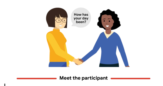
It all started with empathy, which became the heartbeat of our process. To truly redesign efo, we needed to see it from our users’ eyes. Through interviews, we walked alongside them, understanding their frustrations and hopes for an ideal platform. I learned how vital it is to look beyond the data and statistics—to really listen and see the “why” behind every click, every complaint, every suggestion.

As we transitioned to the Define phase, empathy turned into clarity. Mapping out user pain points allowed us to set a clear problem statement: “How might we create an engaging, collaborative space that empowers users?” This question grounded every idea and decision that followed. Brainstorming sessions were like a rapid-fire round of creativity. Some ideas were wild, others simple, but every suggestion aimed to bring DiFE closer to what students and professors needed. Here, I learned the value of every voice, seeing how each team member’s insights could take our solution in new and exciting directions.

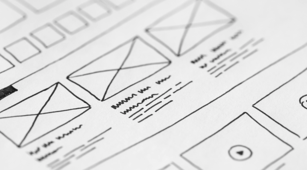
One of the most challenging, yet rewarding, stages was prototyping. Building wireframes in Figma and sketching layouts were more than technical exercises—they were tangible steps toward a vision. Prototyping taught me patience, how every detail counts, and the importance of testing. Seeing our design in users’ hands, watching them navigate the interface, stumble, and give honest feedback was humbling. I realized that what seems like a minor tweak in color or layout can make a big difference in how someone experiences a platform.

Testing brought everything full circle, teaching me that design is never really “finished.” Observing users navigate our prototype highlighted areas that still needed refinement, and every tweak made the experience smoother. Each test session reminded me that the user experience is a journey, not just a destination.

In the end, redesigning DiFE wasn’t just about building a platform; it was about building connections, listening deeply, and creating something meaningful. Through DiFE, I learned that good design is more than functional—it’s intuitive, collaborative, and empathetic. This experience has reshaped my approach to design, teaching me that with every new project, there’s a story to unfold and a user journey to bring to life.


Overcoming Challenges

Our journey to redesign DiFE was full of challenges that, at first, seemed overwhelming. The initial efo platform was outdated and frustrating for students and educators, with poor navigation and limited collaboration features. But as we kicked off with a Design Thinking approach, empathy guided us to the core of these issues. By interviewing users like Ronald, the student, and Professor Mitchell, we saw their struggles firsthand—this was a game-changer.

Through prototyping in Figma, each challenge became an opportunity to learn. Adjusting layouts, refining search functions, and testing usability were rigorous but rewarding steps. Testing with real users revealed where our design needed further tweaks. Watching them interact, struggle, and then seamlessly flow through the platform reminded us that even small adjustments had huge impacts.

Ultimately, overcoming these obstacles was more than technical—it was about creating something truly intuitive and collaborative. Every challenge became a milestone, turning DiFE into a user-friendly space that empowers its community.


Personal Takeaway

Looking back, the DiFE redesign journey felt like learning to see through new eyes. Sitting with users, hearing their frustrations, and then seeing our ideas come to life taught me that empathy isn’t just a step—it’s the foundation of great design. Each tweak, each test wasn’t just a task, but a chance to improve someone’s experience. I realized that design is a journey, one that transforms both the product and the designer along the way.

Do You Have Any Questions about this project? Please feel free to ask.