Topic: HCI. Siegen Website Redesign
Supervisor: Margarita Grinko
Role: UX Designer Methods: Generative research, Workshop facilitation, Storyboards, Journey maps, Personas
Tools: Google Suite, Miro, Dovetail, Figma, UXArmy, Zoom
The HCI department at the University of Siegen found their website difficult for students to navigate and access information. To address this, they launched a project to redesign the site, aiming to make it more user-friendly, functional, and enjoyable. Here’s how we did it. 🙂
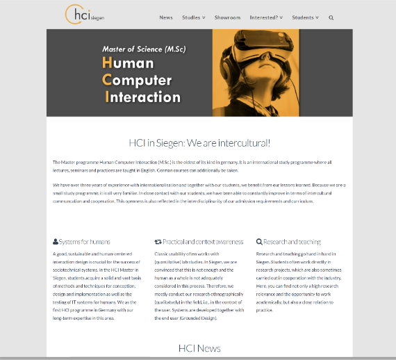
The HCI website was like a cluttered attic, full of valuable info but hard to navigate. Students had trouble finding course details and schedules. Our mission: turn it into an organized, inviting space where everything is easy to find.
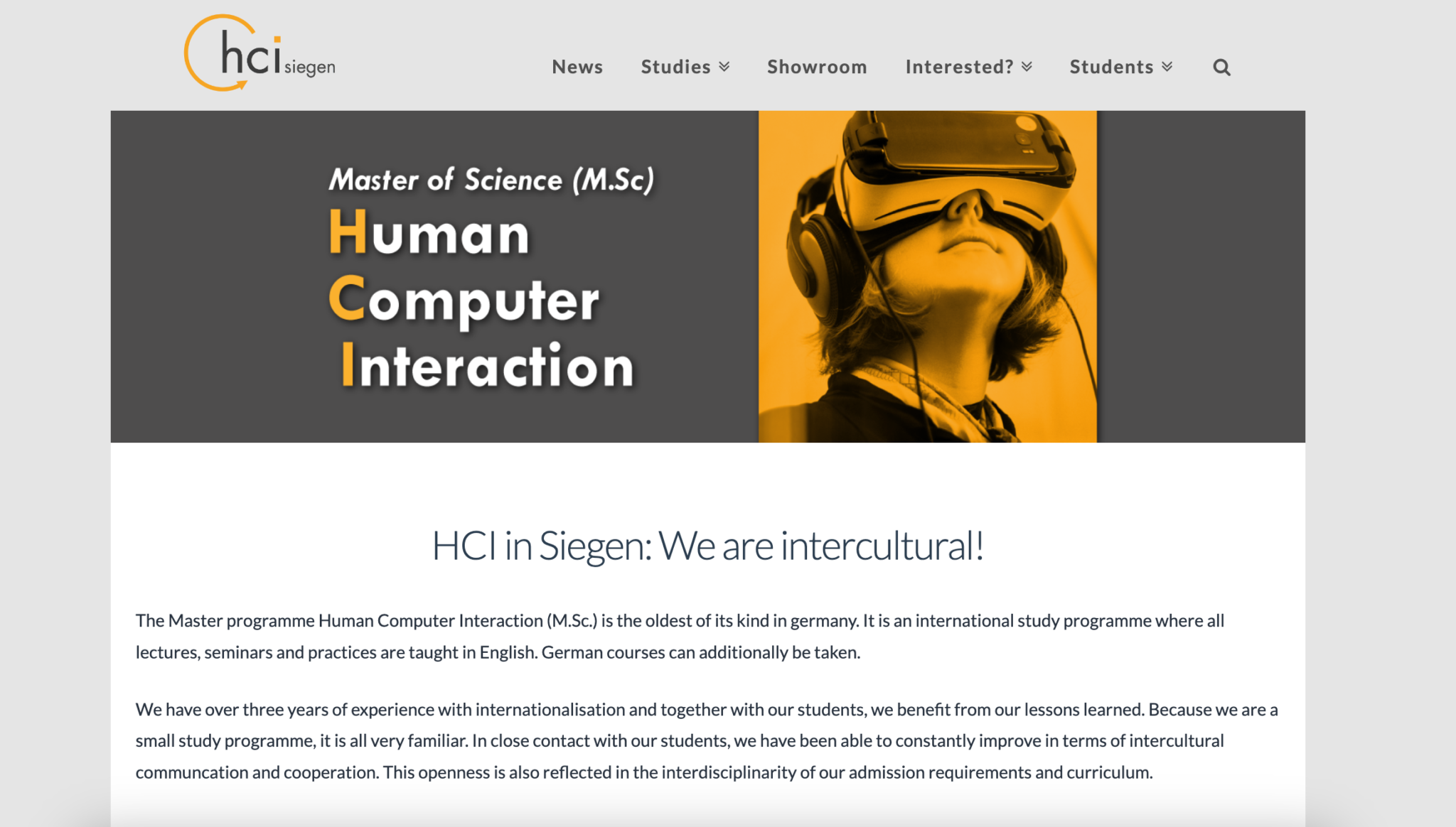
Figure: Past website of university of Siegen
The existing and prospective students needed a website that felt like a helpful guide, not a confusing maze. They wanted easy access to important information about their courses, schedules, and resources. They needed a platform where they could quickly find what they were looking for without getting lost in a sea of links and text. Essentially, they needed a digital hub that catered to their needs, making their academic journey smoother and more enjoyable.
To tackle the HCI website’s usability issues, we’re using a user-centered design approach. Understanding Users through interviews and research helps us address their pain points. Streamlining Navigation simplifies the user journey with an intuitive structure. Content Optimization ensures information is concise and engaging. Enhanced Functionality introduces new features for a better experience. Continuous Testing and Iteration refine our solutions based on user feedback. This approach resolves issues and creates a website that delights and engages users, enhancing their overall experience.
We formulated two research questions for our study to explore:
As we navigated through our project scope, we encountered a significant constraint: we could only use free software. Despite this challenge, we found innovative solutions, ensuring that limitations didn’t hinder our progress.
Inspired by past surveys and UX literature, we gained valuable insights and best practices, guiding us along our journey.We reviewed past documents, such as the survey & gathered UX-related literature.
Apps [starting from the left] – Google Suite, Miro, Dovetail, Figma, UXArmy, Zoom

Our team discussed deliverables and phases for this project, including content inventory and website audit, UX competitive analysis, personas, user interviews, and journey mapping.
Three Phases:
Phase I: Planning – We laid the groundwork, discussing our essential deliverables like content inventory and user interviews. Think of it as plotting the course on our treasure map.
Phase II: Discovery & Explore – Like intrepid explorers, we reached out to fellow students, inviting them to join us on our quest for insights. Zoom meetings became our virtual campfires, where stories and challenges were shared.
Phase III: Design & Test – Armed with newfound knowledge, we crafted solutions that put our users first. We were very careful with the choice as every decision made to enhance the user experience.
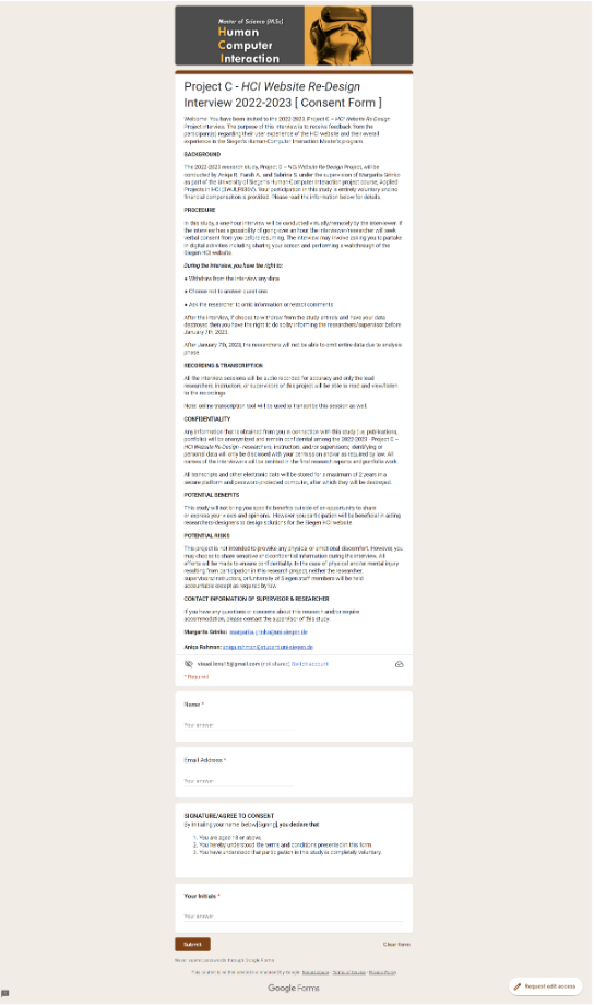
We published Google consent & sign-up forms for students to partake as research participant.
We emailed and scheduled zoom meetings with (six) student research participants.
In the midst of changing seasons, our team conducted a series of remote interviews from November 2022 to January 2023. With guides tailored for Academic Advisor Margarita Grinko and our student research participants, we engaged in insightful conversations.
Using various technologies, we captured discussions in audio recordings and transcribed them with Dovetail. These transcripts guided our path forward.
Miro helped create vivid insights into our users’ experiences. A table of advantages and disadvantages of remote interviews reminded us of our tools, each with its own story. Through remote interviews, we transcended physical boundaries to uncover our users’ stories.
Data Collection
Remote Interviews: November 2022 – January 2023
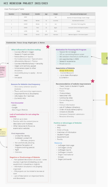
Compiled Interview guides for both Academic Advisor, Margarita Grinko, & student research participants (see table below)
Audio recordings transcribed via Dovetail for qualitative coding or analysis & then summarized in Miro.
On December 14th, at Unter Schloss, our team met for a stakeholder interview workshop with five participants. Through fun activities and discussions, we explored what makes Siegen’s HCI (MSc) program special, like slogans and logos. The goal? To refresh our program’s identity and strengthen community ties. With fresh insights in hand, we’re ready to make Siegen’s HCI experience even better.
Place: December 14th, 3 PM – 5PM at Unter Schloss
Number of Participants: 5
The structure of workshop:
I. Activity Session:
Prompt: “Think of how Siegen’s HCI (MSc) program is unique from other HCI programs?”
Consider Slogan, Mascot, Branding & Re-invent Logo
II. Core Questions Session
III. Conclusion/Wrap-Up

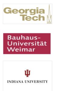
We conducted a competitive analysis of three universities renowned for their HCI programs: Bauhaus-Universität Weimar, Georgia Tech, and Indiana University. By studying their websites, we aimed to understand their strengths and weaknesses, seeking inspiration to enhance our own HCI program’s website and user experience.
Performed analysis on three competitor sites:
(1) Bauhaus-Universität Weimar,
(2) Georgia Tech,
(3) Indiana University
Looked at the advantages/disadvantages and critical takeaways
Consider what features or content we can incorporate on our site – i.e., Call to Action button, Social Proof (videos, photos)
We checked possibly everything on our HCI website, like links and pictures, to see if they were working right. This helped us find what needed fixing and made sure our website was easy for everyone to use. With this info, we made our website better, so everyone could enjoy it more…
Both documented and evaluated the content present on the website (i.e. number of broken links, missing thumbnails)
Listed – Violations of Nielsen’s Usability Heuristics:
Examples: (1) Aesthetic and Minimalistic design – a webpage is a wall of text.
Provided recommendations on what features to add and how to improve the content of the website
Through our journey, we found valuable insights and learned what our users need. Listening to their feedback, we discovered endless possibilities to enhance their experience. Closer to our goal of creating a website that truly delights users.
Qualitative coding – data from transcribed user interviews & notes from stakeholder focus group.
User Interviews – looked at pros & cons of using the website, first impressions, & elements/features/content of the website that influenced one’s decision of applying to the program.
Stakeholder Focus Group – focused on program strengths and weakness, features/elements that can assist with improving the website (i.e. chatbots, User generated content), and resources for academic improvement
Using data, we understood our students better. Feedback from surveys, interviews, and research provided valuable insights into their needs. This guided us in prioritizing features and content to enhance their experience. We made decisions that truly resonated with our users, improving their journey with us.
MoSCoW Prioritization Matrix – Technique for prioritizing features/content based on four criteria, “ Must have,” “Should have,” “Could have,” & “Would like”. For example, Academic Calendar is a must-have for our team, whereas, Chatbot/ Chat support is a “Could-have.”
[Brian’s] Motivation on Pyramid Needs – identifying user needs in the HCI program. Building on opportunities and eliminating threats in our design.
For example, under “Safety and Security”,
A threat = HCI program is financially expensive,
An opportunity = provide financial support/aid (scholarship)

User segmentation and personas help us understand our users better by grouping them based on similar characteristics. This allows us to tailor our design and content to meet their specific needs. By creating personas based on our research, we can empathize with our users, designing experiences that resonate with them. Ultimately, this leads to happier users and better outcomes for our project.
User Segmentation – “Is the practice of dividing potential or existing users into groups that share similar characteristics. The underlying idea is that those groups will likely have comparable behavior and probably respond similarly to marketing/product activities.” (Babich, 2020)
Two groups – Current & Prospective Students
Personas – “Personas are fictional characters, which you create based upon your research in order to represent the different user types that might use your service, product, site, or brand in a similar way.” (Interaction Design Foundation)
Based on the actual user interview data, prospective and current student personas were created.

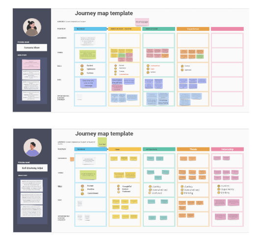
Imagine taking a trip with our users through their experience on our website. Journey mapping lets us visualize their entire journey, from first hearing about us to the final click. Along the way, we see where they might feel frustrated, excited, or confused. Understanding their journey helps ensure every step is smooth and enjoyable, like a well-planned adventure.
Journey Mapping – “Journey mapping helps you visualize how customers experience your product or service, and how they feel along the way” (Atlassian)
Journey of our 3 personas (Prospective and Current) through the website
Before journey mapping, a small user story is presented to provide the background or the goal of the persona (their overall intent)
Journey Mapping emphasizes, “Awareness, Thinks, Feels, and Does.”
In the Design & Test phase, our ideas take shape as we create wireframes and prototypes based on user feedback. We then put these designs to the test, observing how users interact with them and making improvements based on their input. This collaborative process ensures that our final product is user-friendly and meets the needs of our audience.
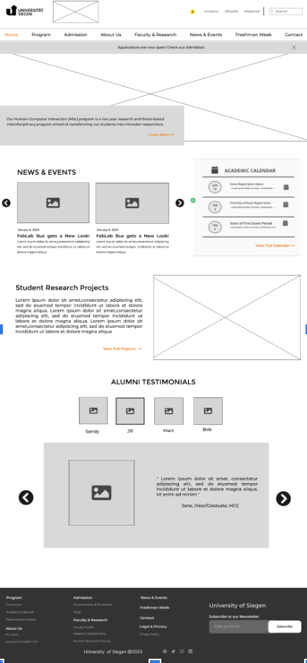
Navigation Structure/Menu – Drawing navigation menu bar inspiration from user interviews & competitor sites
Based on the user interview(s), a page dedicated to, “Theses & Examination” was proposed to help students complete their thesis topics
Prioritizing the most important navigation menu items (content) first – starting from the left → Program, Admission, About Us…
Home
Program
Curriculum
Academic Calendar
Theses & Examination
Experience Abroad
Internship & Jobs
Student Forms
Resources
Admission
Requirements & Procedure
Tuition & Financial Aid
FAQs
About Us
Our Story
Campus & Student Life
HCI Alumni Stories
Faculty & Research
Faculty Profile
Research Departments
Equipment & Labs
Student Research Projects
Research Positions
News & Events
Freshmen Week
Contact
Based on previous deliverables, six wireframes were designed including
Here’s the link to the simple prototype made with Figma.
Performed unmoderated Tree Test via UXArmy
“Tree testing tells you how easily people can find information on your website, and exactly where people get lost.” (Optimal Workshop)
Five task scenarios were presented to the participants.
Example: As a student, you want to know if you are eligible for the HCI Master’s study. Select the option that is the most suitable (Correct Answer: Under Admission)
Successful tasks vs. Unsuccessful tasks (labels)
Advantages: cost-effective, flexible/accessible, anonymous study
Disadvantages: no follow-up question/moderation, the user experience of UXarmy (Analysis section)

Our project encountered several hurdles, with one major challenge being the constraint of using only free software and programs. This limitation restricted our options and functionalities, posing a significant obstacle to our progress. Additionally, the tight timeline added pressure, forcing us to prioritize tasks and make tough decisions about where to allocate our resources. Moreover, the scope of the project was vast, posing the risk of spreading ourselves too thin and losing focus.
Despite obstacles, our team rallied with determination and ingenuity. We embraced the constraint of free software by finding creative workarounds and exploring alternative tools. Effective time management and strategic prioritization optimized our workflow. By focusing on key priorities and leveraging our collective strengths, we successfully navigated the project scope, ensuring targeted and impactful efforts.
n the future, we aim to expand our team with UI designers, coders, and content writers to boost our capabilities. We’ll utilize better software for greater efficiency. Continuously designing and testing wireframes and prototypes, we’ll iterate based on user feedback. Additionally, we’ll focus on building a strong brand identity, creating valuable content, and conducting usability tests to enhance the user experience further..